Kirsty and Kenneth’s wedding invitations
I was asked to design and print wedding invites.
The brief was to create a fold out style, simple and clean design and include a monogram of the first letters of their names. The invites had to include a menu, travel options and general information as well as having a feature where the guests could send something back to say what their food and travel choices were going to be.


Monogram
Both of their names start with K so I was able to acheive a nice symmetrical look. I brought the two letters together to signify tying the knot, uniting both letters, families and representing the whole point of their celebration.
For the reath, the couple wanted something more muted than flowers. We went for some rich green hand drawn foliage which they felt reflected them more accurately. The delicate form of the leaves marries up nicely with the form of the letters.

Paper
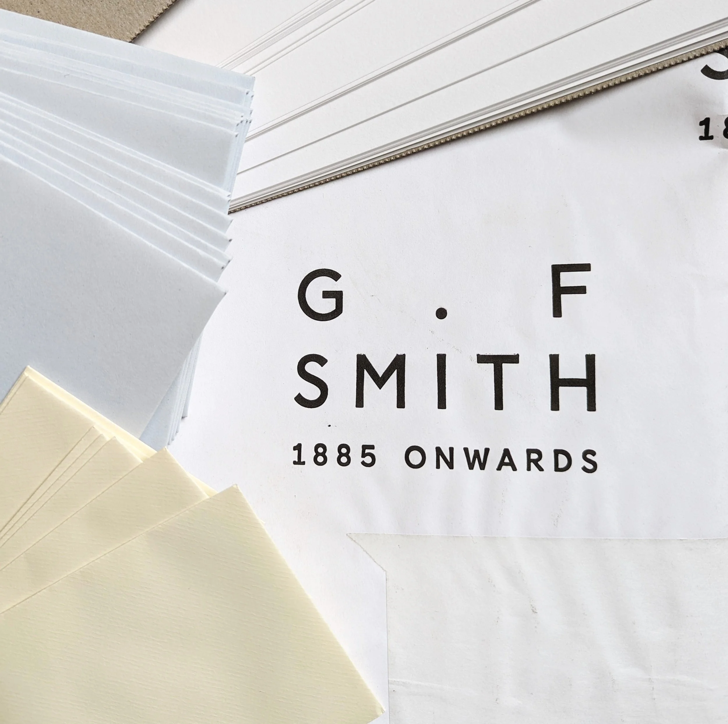
Invite Card - G.F Smith Colourplan Bright White
Invite slip - G.F Smith Colourplan Cool Blue
Invite Envelope - G.F Smith Colourplan Cool Blue
Slip Envelope - G. Lalo - Paris
I went with paper that I know is high quality and have had experience with before. I had to make sure the slip envelope was small enough to fit into the invite envelope but also big enough to be accepted for delivery at the post office. The colour palette is not over bearing and complements the green of the reath perfectly. The blue also was a way of relating back to the wedding, as the famous rhyme goes;
"something old, something new,
something borrowed, something blue,
a sixpence in your shoe."


